
PMS colors give a designer, brand and printer a shared color reference, but the code is only the start of a reliable packaging result. A red chosen from a screen can print cleanly on white coated carton, look darker on brown kraft, lose strength on clear film without enough white ink, and shift again beneath matte lamination. The right workflow connects the official color reference with a named substrate, print process, proof, measurement method and approved production sample. This guide from Packaging NextGen explains that workflow in plain language so U.S. packaging teams can choose, specify and approve color with fewer surprises.
What Are PMS Colors?
PMS colors are numbered color references in the Pantone Matching System, a proprietary color system used across print, packaging and graphic design. A printer can reproduce a selected reference as a premixed spot ink. Depending on the equipment and project, the printer may instead simulate that appearance with CMYK, extended-gamut inks or a digital press.
The important distinction is between a color target and a printing recipe. The PMS designation tells participants which appearance is intended under defined conditions. It does not mean that one universal ink mix will look identical on every paper, plastic film, metal surface or printing press.
Pantone identifies the system as suitable for print and packaging, and its graphics products include physical coated and uncoated references. The official Pantone color-system overview is the right place to confirm current system terminology.
What does PMS stand for in printing? PMS stands for Pantone Matching System. It assigns standardized names or numbers to color references so designers, brands, ink suppliers and printers can communicate a target more consistently than they could with informal descriptions such as “deep red” or “bright blue.”
Why PMS Colors Matter in Packaging
Packaging is viewed under store lighting, daylight, warehouse lighting and phone cameras. It may be printed by several suppliers on multiple materials over many years. A verbal description or an RGB value cannot control that supply chain.
PMS colors help a team:
- name a brand-color target without relying on a monitor;
- separate a dedicated spot ink from CMYK artwork;
- compare a proof or press sample with a physical reference;
- communicate one target to ink, prepress and print suppliers;
- manage a product family across cartons, labels, pouches and shipping cases;
- reduce arguments caused by vague color language;
- record approvals for later reorders.
That shared language has limits. The color still needs a material-specific target and measurable acceptance plan. A PMS code should therefore be written as one part of the print specification, not treated as the entire specification.
PMS Colors Versus CMYK, RGB and HEX
The four systems solve different problems. Confusing them is a common reason packaging artwork changes between design and production.
| System | How it describes or produces color | Best use | Main packaging limitation |
| PMS spot color | A named reference commonly produced with a separately mixed ink | Brand colors, solid areas, colors outside normal CMYK reach | Adds an ink, plate or press unit in conventional printing |
| CMYK | Cyan, magenta, yellow and black halftone dots combine on press | Photographs, illustrations and multi-color artwork | Some brand colors cannot be matched closely within a given CMYK condition |
| RGB | Red, green and blue light form screen color | Websites, apps, video and screen previews | It describes emitted light, not ink on a substrate |
| HEX | A compact digital notation for RGB values | Web and interface design | It is not a press-ready ink standard |
| Extended gamut | CMYK plus added process inks, often orange, green and violet | More spot-color simulations from a fixed ink set | A match depends on press profile, substrate and process control |
PMS Spot Ink
A true spot color is printed from its own ink separation in conventional offset, flexographic or gravure work. Adobe describes spot colors as additional separations, with each one normally requiring its own plate. That may improve control of a key solid color, but it can also add setup, ink, wash-up and press-unit requirements.
Cmyk Process Build
A CMYK conversion represents the target with four process inks. It can be economical when the design already contains photographs, but a conversion is an approximation tied to a press condition and substrate. A CMYK percentage copied from a random website is not a universal equivalent.
Rgb And Hex Preview Values
RGB and HEX can help digital teams show a related brand color on screens. They should not be sent as the only packaging color instruction. Monitor brightness, display gamut, profiles and ambient light all affect what a viewer sees.
When Should Packaging Use PMS Colors?
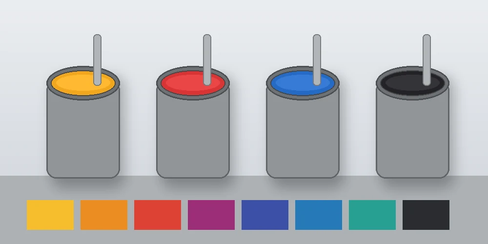
Use a PMS spot ink when the color is important enough to justify a dedicated separation and when the selected printing method can hold it consistently. Typical cases include:
- A primary brand color covering a large solid area;
- A logo used across frequent reorders;
- A hue that sits outside the practical CMYK gamut;
- Fine one-color type or line work;
- A metallic, fluorescent or other specialty ink that process printing cannot reproduce in the same way;
- A limited-color package where one or two spot inks are more efficient than four process inks;
- Regulated or operational markings that require controlled contrast, subject to the applicable specification.
CMYK or extended-gamut simulation may be more sensible when the artwork contains many images, the run is short, every added press unit is costly, or a digital device cannot run a physical spot ink. The decision should be made after the printer reports the expected measured match on the chosen stock.
A Simple Choice Table
| Project condition | Route to evaluate first |
| One-color kraft shipping box | A flexographic spot ink made for the liner |
| Folding carton with photos and one critical logo color | CMYK plus one spot ink |
| Short-run digitally printed carton | Calibrated digital simulation and a physical press sample |
| Large product family across several presses | Controlled spot standards or a validated extended-gamut program |
| Metallic logo | Specialty metallic ink or foil, approved as a separate appearance target |
| Online-only artwork | RGB or HEX brand value, kept separate from the print specification |
How to Read PMS Color Codes
A code normally includes a number or color name plus a suffix that identifies the relevant library or surface presentation. In common graphics work, C indicates a coated-paper reference and U indicates an uncoated-paper reference.
Do not delete the suffix. “PMS 123 C” and “PMS 123 U” point to different printed reference conditions even when they share the same base number. The paper surface changes ink holdout, gloss, absorption and perceived saturation.
PMS Colors C Versus U
Coated stock usually holds ink closer to the surface. That can make a color appear cleaner, darker or more saturated than it does on an absorbent uncoated sheet. Uncoated fibers scatter light differently and can soften the appearance.
Use the suffix that relates to the intended reference. Then approve the result on the actual packaging stock. A coated paper guide does not automatically represent a coated recycled board, a glossy pressure-sensitive film or a laminated flexible pouch.
Pantone’s Formula Guide Coated and Uncoated is a physical reference product for print and packaging. Current guide contents and editions can change, so production teams should verify that all parties are using the same current reference.
Why the Same PMS Color Looks Different on Packaging
Ink is seen together with the surface below it and any finish above it. The following variables can move the result even when the job ticket names the correct PMS color.
Substrate Shade And Surface
White SBS, cream-toned board, gray recycled board and brown kraft reflect different amounts and wavelengths of light. The color of the material can show through a partly transparent ink. Coating smoothness also affects ink holdout and gloss.
Before approving ink, specify the exact paperboard grade and mill sheet when color is critical. A change from one board supplier to another can require a new drawdown or dependent standard.
Ink Opacity And Film Weight
A heavier or more opaque ink layer can appear different from a thin layer. In flexography, anilox volume, plate, impression, viscosity, pH, drying and press speed can affect ink transfer. In offset, ink film thickness, water balance and paper behavior matter. The correct controls depend on the process.
White Ink Beneath Film Artwork
Transparent and metallized materials often need a white underprint. Without it, the product, adhesive, metal effect or reverse-side artwork can influence the color. The white layer needs its own name, separation, opacity target and trapping plan.
Varnish And Lamination
Gloss varnish, matte varnish and lamination change reflected light. A color measured before finishing may not have the same appearance after finishing. If the customer buys the finished package, approval should include the finished package.
Lighting And Metamerism
Two samples can look close under one light source and different under another. This is metamerism. The buyer and printer should name the viewing condition and use a controlled light booth when the decision is important. Store lighting can also be evaluated as a secondary condition.
Reference-Guide Condition
Paper guides can fade, yellow, become dirty or collect oils through handling. Pantone’s guide-replacement guidance recommends a 12-to-18-month cycle because handling, ultraviolet exposure and paper aging can change appearance. Do not settle a production dispute by comparing one clean new guide with another team’s heavily used old guide.
PMS Colors Across Packaging Materials

Folding Cartons
Offset-printed folding cartons can combine detailed CMYK images with one or more spot inks. Coated board supports fine detail, but board shade, coating and post-print finish still affect the result. Approve the color after the intended varnish or lamination when possible.
Corrugated Boxes
Direct flexographic print on corrugated liner is affected by liner shade, surface smoothness, flute profile and impression. Brown kraft can pull a color toward a darker, earthier appearance. Preprint and litho-laminated routes offer different print characteristics. Track wider changes through the site’s coverage of corrugated printing developments, then validate the exact route with the converter.
Pressure-Sensitive Labels
Paper labels, white films, clear films and metallic films need separate evaluation. Clear labels may require a white layer; metallic materials can create a color-plus-metal appearance that a paper guide does not show. Adhesive and container color can also influence perception.
Flexible Packaging
Flexible packs may be surface printed or reverse printed, then laminated. Ink is viewed through film in a reverse-printed structure, and adhesive plus film optics can change the result. Heat resistance, sealing, rub and migration requirements also influence the ink system. Review current food-packaging printing updates when the pack has food-contact or regulatory requirements.
Bottles, Sleeves And Direct Decoration
Glass color, bottle contents, label opacity, sleeve shrink and curved viewing can all change brand-color appearance. A bottle label and decoration workflow needs standards for the real container, not only the flat artwork.
Metal And Specialty Surfaces
Metal cans, foil and holographic structures reflect light directionally. A conventional spectrophotometer reading may not describe every visual effect. Align measurement equipment and visual criteria with the appearance being approved.
PMS Colors by Printing Process
Offset Lithography
Offset presses can run a premixed spot ink in a separate unit. This route is common for folding cartons and paper labels. The printer should control ink film, plate condition, water balance and sheet color, and should record the approved press condition for reorders.
Flexographic Printing
Flexo is used for corrugated boxes, films, labels and many paper formats. The ink system, anilox, plate, tape, impression and drying conditions influence the solid. A spot ink that works on coated label paper may need a different formulation or dependent target on kraft liner or polyethylene film.
Gravure Printing
Gravure can produce stable long runs on flexible materials, but cylinder engraving, ink system, viscosity and lamination construction still matter. The brand should approve the completed structure.
Digital Printing
Many digital presses simulate PMS colors from their installed ink set rather than loading a separately mixed spot ink. Some devices include extra colors that widen the gamut. Ask the printer for a measured result on the actual stock and do not assume that “Pantone capable” means every PMS reference is reproduced within one fixed tolerance.
Extended-Gamut Printing
Extended-gamut systems commonly add orange, green and violet to CMYK. Pantone notes that expanded process sets can produce closer simulations for more solid colors than CMYK alone. The benefit is a stable ink set across many jobs, but the result remains a process simulation tied to a characterized press and substrate.
How to Select PMS Colors for a Package
1. Start With The Production Material
Identify the actual board, paper, film, foil, bottle or metal surface. Record color, coating, supplier, grade and finish. If several structures will carry the same brand, treat each as a separate print condition.
2. Review A Current Physical Guide
Use the suitable coated or uncoated physical reference under controlled lighting. An online chart is useful for navigation, but it is not an approval device. Record the full code and suffix.
3. Ask Whether The Press Will Run A Real Spot Ink
The phrase “PMS match” can mean a premixed spot ink, a CMYK build or a digital simulation. State the route in writing. Ask how many press units are available and whether white, varnish or another specialty ink uses one of them.
4. Request A Drawdown Or Material Proof
An ink drawdown on the intended stock reveals absorption, opacity and surface effects early. For film or foil, include the planned white backing and viewing construction.
5. Agree On An Approval Target
Choose the master: a current guide, a measured spectral value, a signed physical sample or a substrate-specific dependent standard. Large programs often use both digital spectral data and physical samples.
6. Define How Color Will Be Judged
Record the instrument, geometry, illuminant, observer, measurement condition, backing, aperture, Delta E formula, sample location and tolerance. Add a visual assessment under named lighting.
7. Approve Production And Retain Evidence
Approve the finished pack, not an unfinished sheet when the finish changes appearance. Keep the measurement report, signed sample, ink batch or formula reference, substrate lot details and artwork version.
How to Set Up PMS Colors in Packaging Artwork
Color control can fail before ink reaches the press. The file must preserve the intended spot separation.
Build The Artwork On The Correct Structure
Use the converter’s latest packaging dieline and confirm panels, seams, folds, glue areas, seals, bleed, barcodes and print-free zones before applying color.
Create A True Spot-Color Swatch
In the design application:
- Create or import the approved color through an authorized current library.
- Set the swatch color type to Spot Color, not Process Color.
- Preserve the official swatch name and suffix.
- Apply one consistent swatch to every object intended for that plate.
- Remove duplicate aliases that could create extra separations.
- Keep white ink, varnish, foil, cut and technical colors clearly named and separate.
Check Separations and Overprint
Turn on Separations Preview and Overprint Preview. Hide plates one at a time to confirm that each object appears on the intended separation. Adobe’s Illustrator separation instructions also warn that an on-screen separation preview cannot show every press variable, including trapping and halftone details.
Check for:
- a spot color converted accidentally to CMYK;
- two nearly identical spot swatch names creating two plates;
- white objects set to overprint and disappearing;
- a dieline or notes plate left printable;
- incorrect overprint between dark and light inks;
- missing choke or spread around white underprint;
- transparent effects that alter separations;
- raster images containing a process approximation instead of the spot channel;
- a barcode built from several inks and vulnerable to misregistration.
Export A Controlled Production Pdf
Follow the printer’s PDF/X, bleed, profile and font requirements. Ask whether the printer wants a composite file for RIP separation. Supply a low-resolution visual and a written ink list as checking aids, but treat the approved production PDF as the controlled file.
Proofing PMS Colors: What Each Proof Can and Cannot Show
Not every item called a proof answers the same question.
| Proof or sample | Useful for | Cannot prove by itself |
| Uncalibrated screen PDF | Copy, position and version review | Press color |
| Calibrated soft proof | Process-color expectation under controlled setup | Exact material texture, opacity and every overprint or finish effect |
| Contract hard proof | A measured visual reference for a defined proofing condition | All physical properties of the production substrate |
| Ink drawdown | Spot ink appearance and opacity on a chosen material | Registration, trapping and full press behavior |
| Wet proof or press trial | Press, ink and substrate interaction | Long-run variation unless control limits are tested |
| Finished production sample | The package appearance the customer receives | Future reorders without retained data and change control |
Fogra explains that ISO 12647-7 contract proofs provide a color-accurate visual reference under specified criteria and tolerances. See its contract proof creation overview for the role of a controlled proof. A spot-color drawdown and press sample may still be needed because a standard process proof may simulate the spot instead of laying down the production ink on the production material.
A 3D packaging mockup helps check panel flow, hierarchy and shelf presentation. It should not be treated as a physical color approval.
Measuring PMS Colors on Printed Packaging
Visual approval matters, but instrument data makes expectations easier to exchange and repeat.
Spectrophotometer
A print spectrophotometer measures reflected light across wavelengths and can report values such as CIELAB. X-Rite notes that 0°:45° instruments are widely used in print and packaging. Instrument geometry, aperture and measurement settings should remain aligned across sites.
Lab* Values
CIELAB describes color with three coordinates:
- L* represents lightness;
- a* represents the red-to-green axis;
- b* represents the yellow-to-blue axis.
These coordinates are more useful for measured print communication than an RGB screenshot, but they must still be accompanied by measurement conditions.
Delta E
Delta E expresses the distance between a target and sample in a selected color-difference formula. X-Rite’s color-consistency explanation notes that a higher Delta E indicates a larger measured difference.
There is no responsible universal pass value for every package. A tolerance that works for smooth white label stock may be unrealistic on mottled recycled kraft or textured corrugated liner. The brand and printer should agree on:
- the formula, such as ΔE00 or another named formula;
- average and maximum limits where relevant;
- the target and backing;
- the number and location of readings;
- whether gloss or metallic appearance needs a separate test;
- the visual acceptance rule;
- what happens when a result sits near the limit.
M Conditions And Optical Brighteners
Papers containing optical brightening agents can respond differently to ultraviolet content in the light source. Specify the measurement condition, such as M0 or M1, rather than comparing readings collected under unknown settings.
Measure The Right Area
Use a patch large and uniform enough for the instrument aperture. Avoid creases, fluting valleys, scuffs, seams, variable white underprint and areas contaminated by another ink. On corrugated board, several readings may be needed to understand surface variation.
A Reliable PMS Color Approval Specification
A short purchase-order note saying “match PMS” leaves too much undecided. Use a specification table like this:
| Field | What to record |
| Color identification | Full PMS code and suffix, or approved custom brand-color name |
| Print route | True spot ink, CMYK simulation, extended gamut or digital simulation |
| Substrate | Supplier, grade, color, coating, caliper and approved alternate |
| Structure | Surface or reverse print, white backing, adhesive, film and finish layers |
| Reference | Guide edition, spectral master, drawdown or signed sample |
| Measurement | Instrument, geometry, aperture, backing, M condition, illuminant and observer |
| Difference formula | Named Delta E method |
| Tolerance | Agreed average, maximum and visual limits |
| Proof | Required proof or press-trial level |
| Production control | Sampling frequency, control patch and escalation step |
| Reorder control | Artwork version, substrate changes, ink record and retained sample policy |
Managing PMS Colors Across Multiple Suppliers
One physical guide on a designer’s desk is not enough for cartons, labels, pouches and corrugated cases produced in several plants.
Establish A Master And Dependent Standards
The master expresses the central brand intent. A dependent standard records the achievable approved appearance on a defined process and substrate. For example, a brand may have separate measured targets for coated carton, kraft corrugated liner and reverse-printed film.
This approach acknowledges material reality without allowing every printer to choose a different red. Pantone explains that PantoneLIVE can hold packaging- and label-specific dependent digital standards; its Pantone Connect and PantoneLIVE comparison distinguishes designer access from packaging production use.
Align Devices And Settings
Two instruments can disagree if their geometry, calibration, aperture or settings differ. Establish calibration schedules, inter-instrument checks and a shared measurement procedure. Idealliance’s BrandQ supply-chain program highlights the importance of agreed expectations, evaluation methods, tolerances and validation between brand owners and suppliers.
Control Changes
Require notice before changes to:
- substrate mill or grade;
- ink system or ink supplier;
- print plant or press;
- plate, cylinder or anilox specification;
- white ink opacity;
- adhesive, varnish or lamination;
- artwork, RIP or color library;
- measurement instrument or settings.
A small material change can create a visible brand-color shift even when the PMS code on the file stays unchanged.
Cost of PMS Spot-Color Printing
A spot ink can add cost through ink mixing, plate or cylinder preparation, press setup, wash-up, inventory and an extra press unit. The financial effect depends on process, run length, ink type, number of colors and whether the press already runs CMYK.
It may save money in a simple one- or two-color job that does not need four-color process. It may also reduce color disputes and rework for a brand-critical solid. Ask printers to quote the same approved design through realistic alternatives:
- one or two spot inks;
- CMYK simulation;
- CMYK plus one brand spot;
- extended-gamut simulation;
- calibrated digital production.
Compare measured match, consistency, minimum order, setup waste, run speed and reorder risk—not only unit price.
Common PMS Color Mistakes
Choosing From An Uncalibrated Monitor
The screen can narrow choices, but it cannot replace a current physical reference or an approved material sample.
Omitting C Or U
The suffix is part of the reference. Leaving it out forces the printer to guess which condition the designer intended.
Sending Only Rgb, Hex Or A Screenshot
These can support digital brand use but do not define a packaging spot ink.
Assuming Every Digital Press Prints True Spot Ink
Many devices simulate PMS colors from their installed process inks. Ask for a physical, measured sample.
Using An Old Physical Guide
Age, light, dirt and handling change paper references. Date and control the guides used for approval.
Approving The Ink Before Finishing
Matte film, gloss varnish and laminates can alter the final appearance. Inspect the complete structure.
Ignoring The White Layer
Clear, metallic and colored materials may need controlled white opacity beneath the color.
Using A Universal Delta E Number
Tolerance must fit the process, surface, instrument and brand requirement. Record the entire measurement method.
Accidental Process Conversion
An artwork export or Ink Manager setting can convert a spot swatch into CMYK. Inspect the final PDF separations.
No Reorder Reference
Keep the approved file, standard, measurements and production details. A faded carton pulled from a warehouse months later is a weak master.
Packaging Buyer Checklist for PMS Colors
Before artwork approval:
- Confirm the exact substrate and finish.
- Select the color from the right current physical guide.
- Record the full PMS code and suffix.
- Decide whether production uses true spot ink or a process simulation.
- Confirm available press units and the need for white, varnish or specialty inks.
- Use one correctly named spot swatch throughout the artwork.
- Inspect separations, overprints, transparency and technical plates.
- Request a drawdown or material-specific physical sample.
- Define the target, instrument settings, Delta E formula and tolerance.
- Approve under controlled light and a relevant use-environment light.
- Inspect the finished package after varnish, lamination or forming.
- Save the approved sample, measurement report and artwork version.
Frequently Asked Questions
What Are PMS Colors In Printing?
PMS colors are standardized references in the Pantone Matching System. In conventional printing, a PMS reference can be produced with a separately mixed spot ink. It can also be approximated through process or digital printing when the job specification allows a simulation.
What Does PMS Stand For?
PMS stands for Pantone Matching System. It is a proprietary system used to identify and communicate color references for print and packaging.
Are PMS And Pantone Colors The Same?
People often use the phrases interchangeably in graphics work. Pantone operates several color systems, while PMS usually refers to the Pantone Matching System used for graphic and print applications. State the exact library and suffix rather than relying on shorthand.
What Is The Difference Between PMS Colors And Cmyk?
A PMS spot color is normally a named target printed with a separately mixed ink and its own separation. CMYK produces colors by combining cyan, magenta, yellow and black process dots. A CMYK build may approximate a PMS target but is not automatically identical.
What Do C And U Mean In PMS Color Codes?
C indicates a coated-paper reference and U indicates an uncoated-paper reference. The surface changes color appearance, so the suffix should remain in the print specification.
Can I Use An Online PMS Color Chart For Print Approval?
Use an online chart to search or shortlist, not for final approval. A monitor displays RGB light and varies by device and settings. Review a current authorized physical guide and a proof on the intended packaging material.
Can A Digital Printer Match PMS Colors?
Many digital presses can produce close simulations, especially with added ink colors and good calibration. The achievable match varies by device, ink set and substrate. Ask for the measured Delta E and approve a physical sample.
Do PMS Colors Cost More To Print?
They can. A separate spot ink may require another plate or cylinder, press unit, setup and wash-up. A simple one- or two-color job can sometimes be efficient with spot inks. Compare quotes for the actual design and run.
Why Does My PMS Color Look Different On Kraft Paper?
Kraft paper is darker and less neutral than white coated stock. Ink opacity, absorption and surface texture allow the brown substrate to influence the result. Request a drawdown on the exact kraft liner and set a substrate-specific target.
Why Does The Same PMS Color Differ Between A Carton And A Label?
The carton and label may use different materials, ink systems, print processes, white points, coatings and finishes. Each combination may need its own approved dependent standard even when both are connected to one master brand color.
Can PMS Colors Be Converted To Rgb, Hex Or Cmyk?
Approximate conversions can be made for particular digital or print conditions. They are not universal equivalents. Use a defined profile or authorized conversion tool, test the result and keep print and screen specifications separate.
How Are Printed PMS Colors Measured?
A print spectrophotometer measures reflected light and can report CIELAB values. The sample is compared with a target using a named color-difference formula such as Delta E 2000. Instrument geometry, backing, aperture, lighting condition and tolerance should all be documented.
Is A Low Delta E Always A Visual Match?
Not in every situation. Texture, gloss, metallic effects, translucency and lighting can affect visual judgment. Use measurement together with controlled visual assessment and a tolerance suited to the packaging process.
How Often Should A Pantone Guide Be Replaced?
Pantone commonly advises replacing graphics guides every 12 to 18 months, depending on handling, fading and storage. Record purchase dates and keep guides away from strong light, moisture, dirt and oils.
Is White A PMS Spot Color In Packaging Artwork?
Opaque white used beneath clear or metallic packaging artwork is normally set up as a named spot separation, but its specification is more than a Pantone code. Define the white ink system, opacity, number of hits, print order, choke or spread and measurement method with the printer.
Final Takeaway
PMS colors work best as a shared starting point within a controlled packaging process. Select the right coated or uncoated reference, keep the full code in the file, state whether the press will use a true spot ink or a simulation, and approve the result on the intended substrate with the intended finish.
For repeatable packaging, connect the color name with a material, proof level, lighting condition, spectral target, tolerance and signed production sample. Packaging NextGen recommends documenting every one of those items before a purchase order is released. That discipline gives designers, buyers, ink teams and printers the same answer when they ask what the approved color is.
Editorial note: Pantone and Pantone Matching System are trademarks of Pantone LLC. This independent educational guide is not affiliated with or endorsed by Pantone. It does not reproduce Pantone color values, ink formulas or proprietary charts. Packaging NextGen advises readers to use current authorized references and confirm production requirements with their printer.